I want to thank all of my lovely models Lauren, Laura, Courtney and Shell. And I especially want to thank Jordyn Avalee because she brainstormed with me, built costumes with me, assisted in the studio and overall just made the whole thing happen. Without her I would have been so lost. Thanks so much :)


__


__


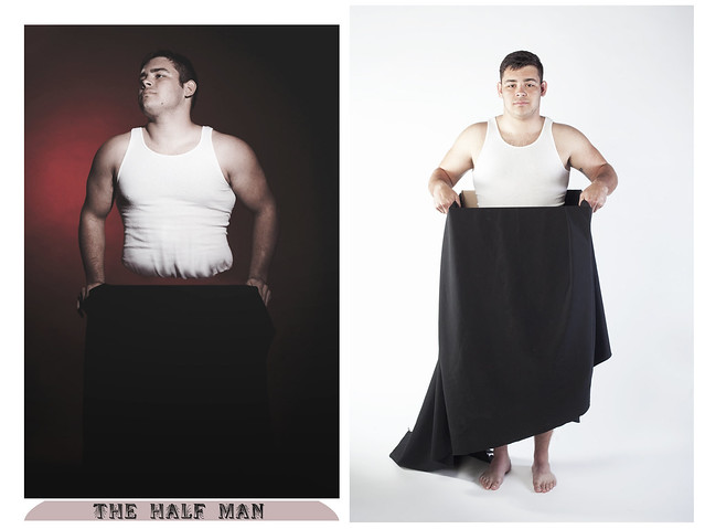
This photographic set comes from my intrigue with the dynamics of Circus culture in America in the 1930’s. The grandiose and elaborate stages in circuses once served for a pedestal upon which many characters were created and idealized. These characters were meant to shock, amuse and surprise. With much research I have come to find that many of the sideshow ‘freaks’ were average people, usually with some type of physical deformity that could be glamorized into something whimsical. The circus is where they found their place when they were ostracized in their own homes for being strange and different. While many photographers, such as Diane Arbus, have taken the direct approach and photographed these “freaks”, I chose instead to fabricate them. In this series I wanted to shed light on the humanity that lies underneath the glitz and glamour of the stage lights. I wanted to show the optical illusions and also shatter them. I wanted to create and destroy each character. I chose three less frequently seen sideshow attractions, which I named, ‘The Two Headed Lady’, ‘Live Mermaid’, and ‘The Half Man’.
My diptychs have relatively consistent lighting situations and backdrops. The first image in each pair is of the character on stage, as an awestruck audience would see them, in full costume and make up. The lighting is a spotlight, leaving some things in shadow, to create the feeling of a performance.
The second image is the big reveal, as I see it. The character is on a stark white backdrop, void of all vague lighting or optical illusions. No more costumes or trick lighting. It is just an honest portrait revealing that the character is not at all who you think they are. They are just people, with bad habits, bad attitudes and also pretty bad special effects. They aren’t even conjoined, or cut in half or from the deep depths of the ocean.
These diptychs serve as a before and after for me, and I feel like with these I am just scratching the surface of what my upcoming work will turn into. Although the images are meant to be polar opposites, that element also brings them together. They are so different, yet you are still forced to compare them because of a few consistent elements, a mermaid tail, a black box, and a set of pale faces staring back at you. The stare of each character in the second image of each pair is meant as a confrontation, a challenge and even an admission of defeat. Like, “You’ve caught me, it’s an act, congratulations.”
It’s almost sad, to me. As though being a normal person isn’t good enough for them, like they need to create the character to feel important. I think there’s a lot to be said about it, but like I said before, I have barely gotten to the bottom of it. I am sure I will though.
<3

This a very beautiful, interesting and thought-provoking series. I love the lighting and all of the effort that clearly went into shooting.
ReplyDeletethese are so cool!!!
ReplyDeleteWow! What a wonderful idea! I love everything!
ReplyDeletethis is so cool! love the mindfuck photos :)
ReplyDeletewould you like to follow each other?
A
xx
http://epiquemoi.blogspot.com
Wow, these turned out so cool!
ReplyDeleteJillian - PS, if you have a moment, I'd love to invite you to check out the giveaway we're hosting for a $50.00 giftcard to Shabby Apple!
http://epic-thread.blogspot.com/2013/03/shabby-apple-giveaway.html